data visualization
データの可視化はデータ分析において重要な役割を果たします。幸いなことに、Rはこの点で他のプログラミング言語よりも優れた機能を持っており、ggplot2をはじめとする多くの機能を利用することができます。
一方、データの可視化は、色やレイアウトなどの追加のカスタム修正 が必要な場合もあります。これをR内で行うことができれば素晴らしいのですが、時には複数行のコードを使用するよりも、pptなどの外部プログラムを使用した方が簡単な場合もあります。
以前の記事 では、officerパッケージを使用してMSパワーポイントでベクター画像を作成および編集する方法を紹介しました。この記事では、Rで複数の画像を作成および編集するために使用されるRおよびRパッケージの高度な方法を紹介します。
result
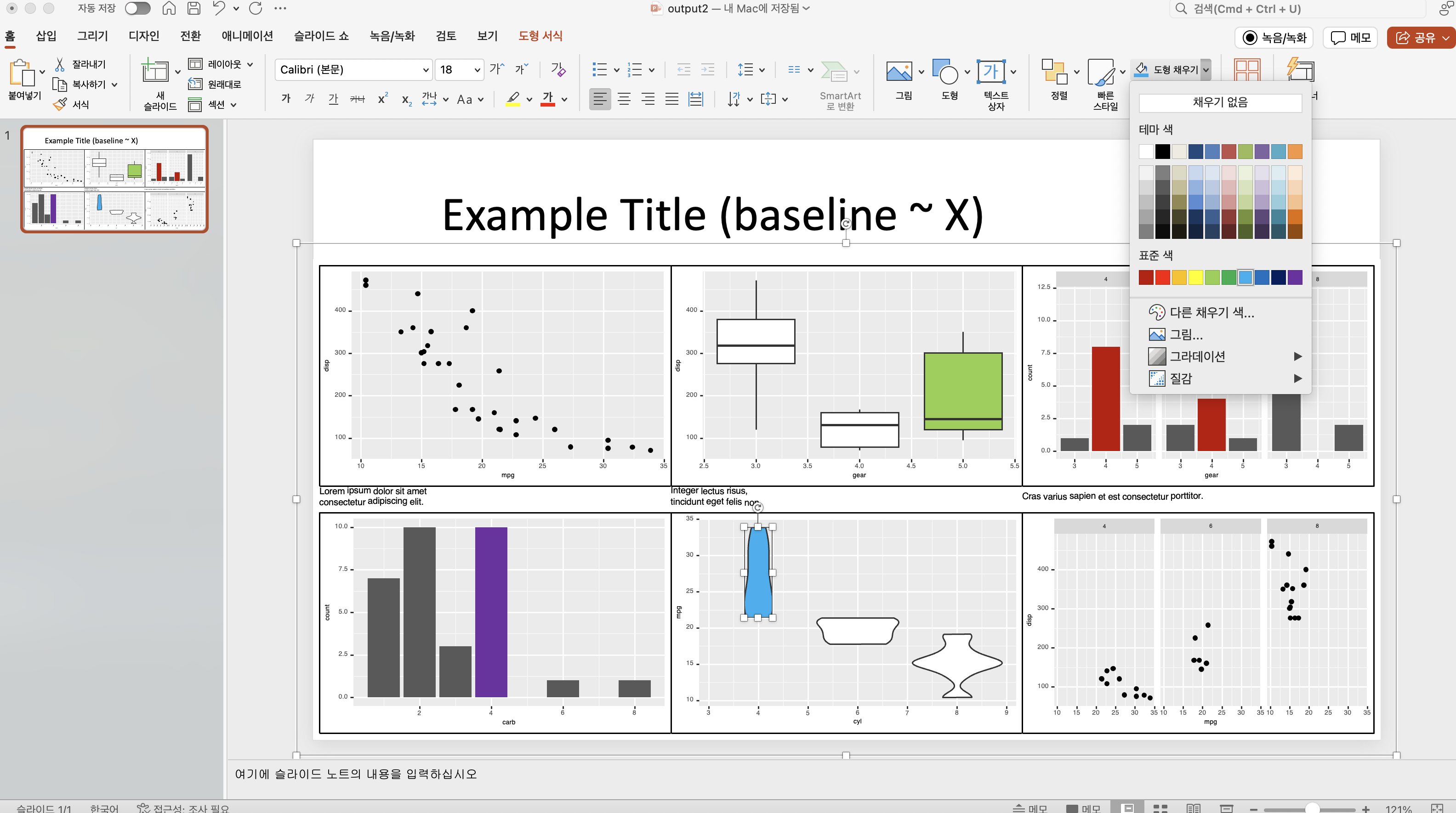
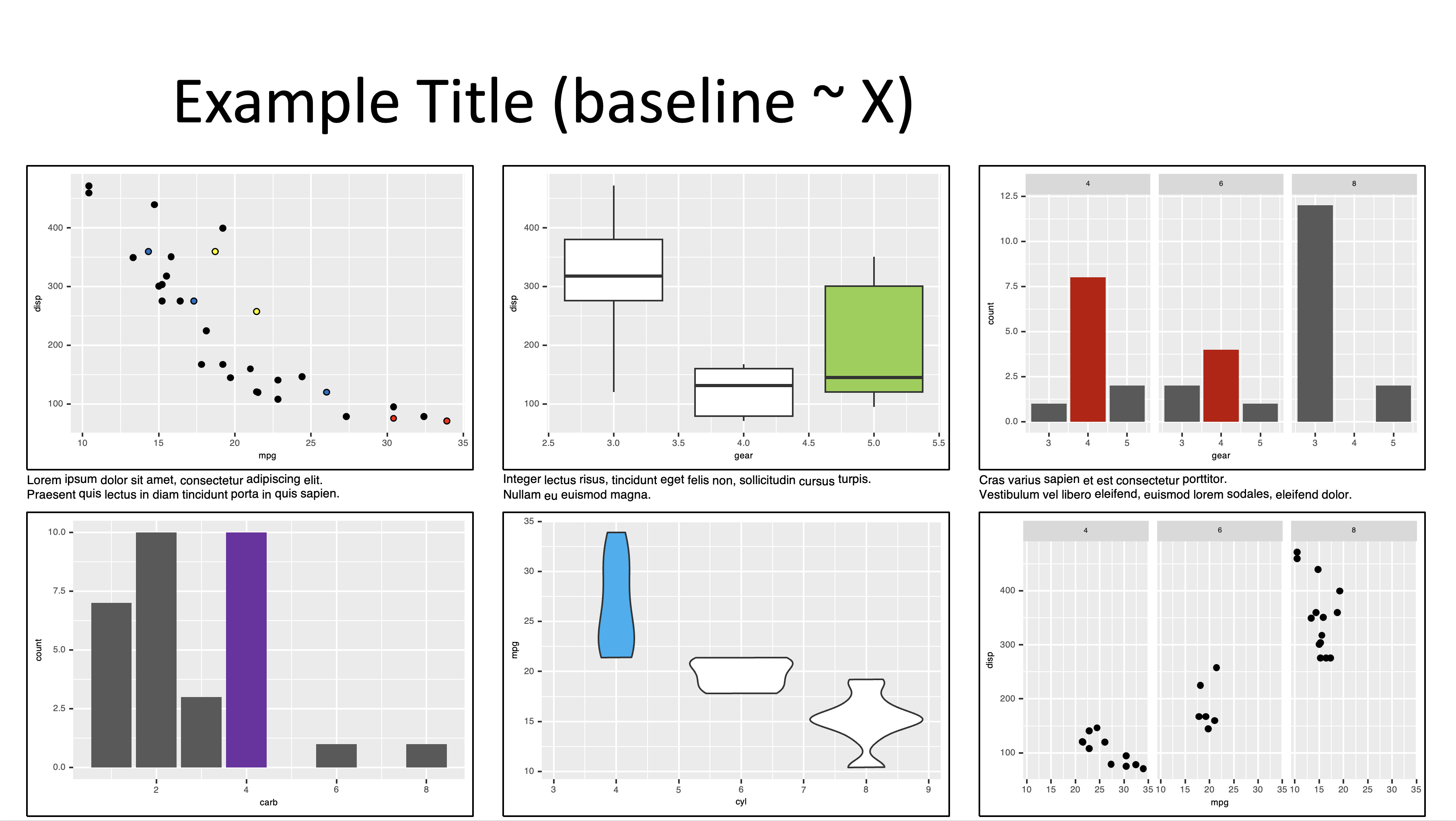
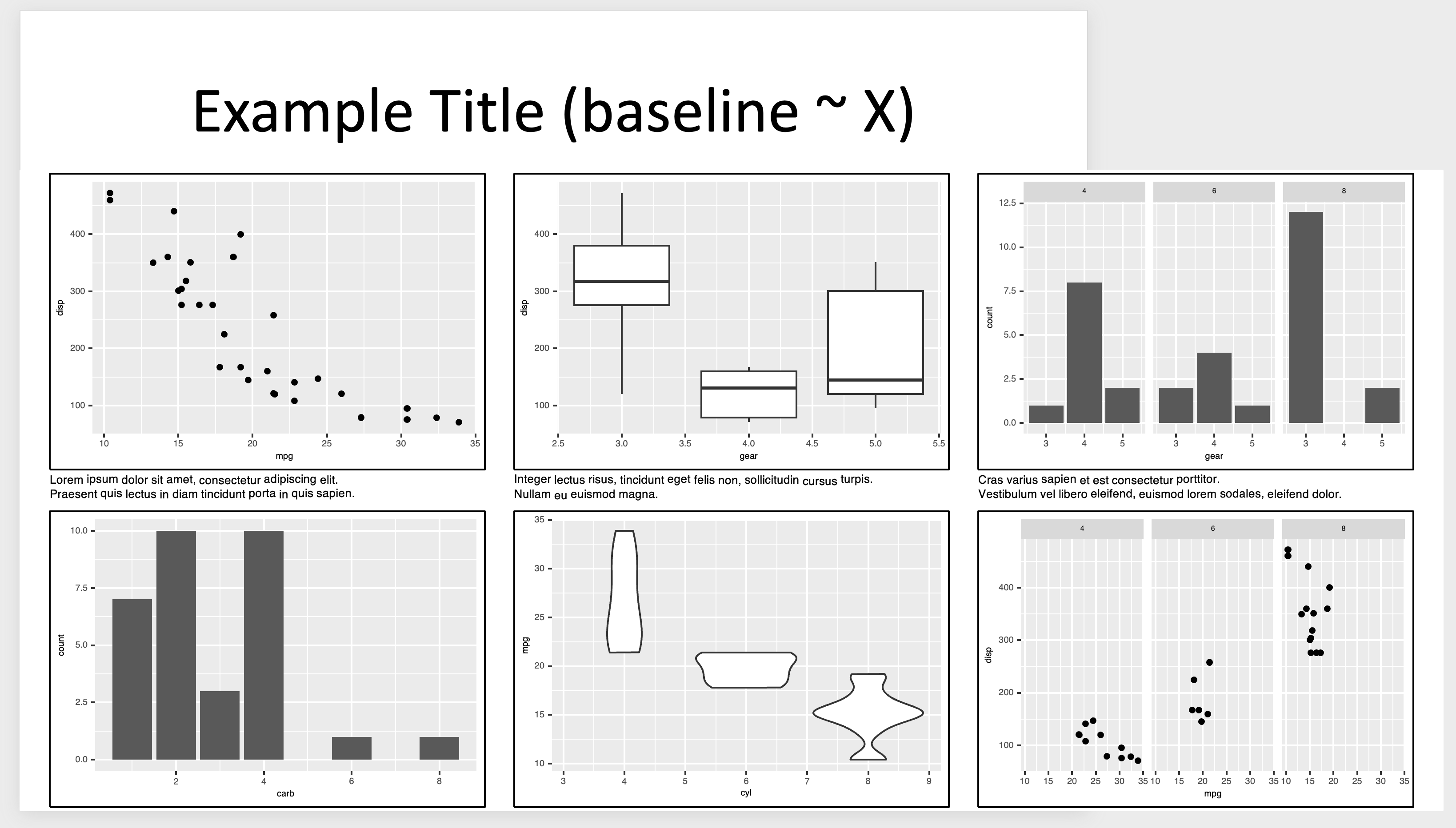
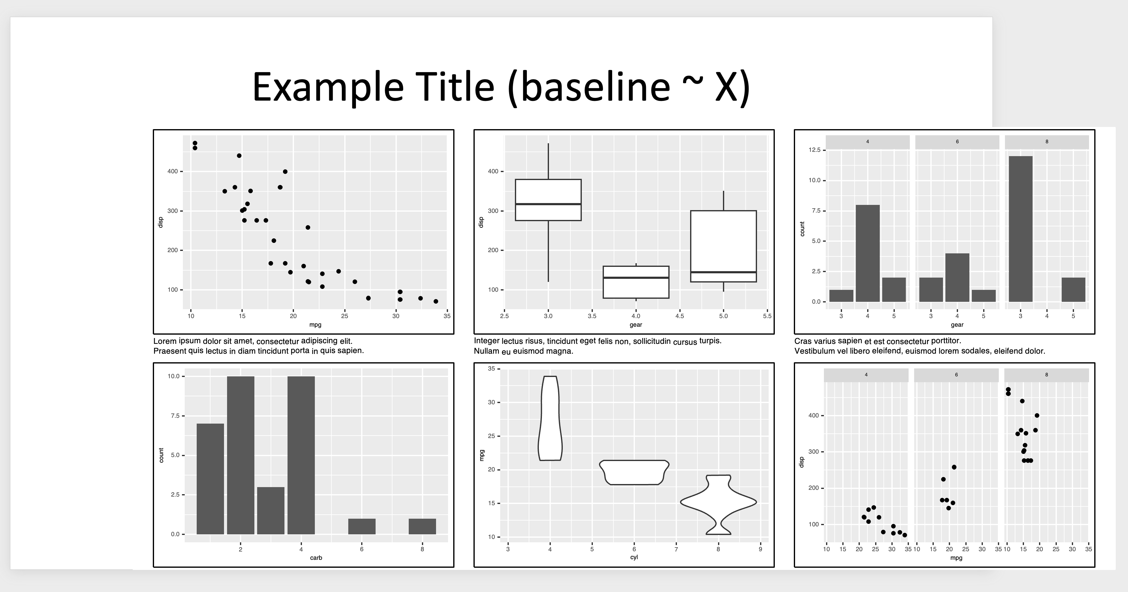
この記事で紹介する方法を適用したpptの結果を最初に紹介します。
まず、上記の画像は、次のような結果です。
Rで作成された 可視化 を使用して ggplot2
cowplotを使用して ボックス で囲み
レイアウト を使用して 可視化 と説明のための テキスト を配置するために patchworkを使用
officerを使用して、ワイドスクリーン(または16:9)解像度を使用して MSパワーポイント で作成されました。
これらの結果はベクターグラフィックスを使用しているため、次の画像に示すように、pptで簡単にカスタマイズできます。
patchwork
この記事で使用する例の画像は、ggplot2のmtcarsデータセットを使用したpatchworkの例コードに基づいています。ggplot2と各チャートについては別途説明しません。
Mazda RX4
21.0
6
160.0
110
3.90
2.620
16.46
0
1
4
4
Mazda RX4 Wag
21.0
6
160.0
110
3.90
2.875
17.02
0
1
4
4
Datsun 710
22.8
4
108.0
93
3.85
2.320
18.61
1
1
4
1
Hornet 4 Drive
21.4
6
258.0
110
3.08
3.215
19.44
1
0
3
1
Hornet Sportabout
18.7
8
360.0
175
3.15
3.440
17.02
0
0
3
2
Valiant
18.1
6
225.0
105
2.76
3.460
20.22
1
0
3
1
Duster 360
14.3
8
360.0
245
3.21
3.570
15.84
0
0
3
4
Merc 240D
24.4
4
146.7
62
3.69
3.190
20.00
1
0
4
2
Merc 230
22.8
4
140.8
95
3.92
3.150
22.90
1
0
4
2
Merc 280
19.2
6
167.6
123
3.92
3.440
18.30
1
0
4
4
Merc 280C
17.8
6
167.6
123
3.92
3.440
18.90
1
0
4
4
Merc 450SE
16.4
8
275.8
180
3.07
4.070
17.40
0
0
3
3
Merc 450SL
17.3
8
275.8
180
3.07
3.730
17.60
0
0
3
3
Merc 450SLC
15.2
8
275.8
180
3.07
3.780
18.00
0
0
3
3
Cadillac Fleetwood
10.4
8
472.0
205
2.93
5.250
17.98
0
0
3
4
Lincoln Continental
10.4
8
460.0
215
3.00
5.424
17.82
0
0
3
4
Chrysler Imperial
14.7
8
440.0
230
3.23
5.345
17.42
0
0
3
4
Fiat 128
32.4
4
78.7
66
4.08
2.200
19.47
1
1
4
1
Honda Civic
30.4
4
75.7
52
4.93
1.615
18.52
1
1
4
2
Toyota Corolla
33.9
4
71.1
65
4.22
1.835
19.90
1
1
4
1
Toyota Corona
21.5
4
120.1
97
3.70
2.465
20.01
1
0
3
1
Dodge Challenger
15.5
8
318.0
150
2.76
3.520
16.87
0
0
3
2
AMC Javelin
15.2
8
304.0
150
3.15
3.435
17.30
0
0
3
2
Camaro Z28
13.3
8
350.0
245
3.73
3.840
15.41
0
0
3
4
Pontiac Firebird
19.2
8
400.0
175
3.08
3.845
17.05
0
0
3
2
Fiat X1-9
27.3
4
79.0
66
4.08
1.935
18.90
1
1
4
1
Porsche 914-2
26.0
4
120.3
91
4.43
2.140
16.70
0
1
5
2
Lotus Europa
30.4
4
95.1
113
3.77
1.513
16.90
1
1
5
2
Ford Pantera L
15.8
8
351.0
264
4.22
3.170
14.50
0
1
5
4
Ferrari Dino
19.7
6
145.0
175
3.62
2.770
15.50
0
1
5
6
Maserati Bora
15.0
8
301.0
335
3.54
3.570
14.60
0
1
5
8
Volvo 142E
21.4
4
121.0
109
4.11
2.780
18.60
1
1
4
2
mtcars
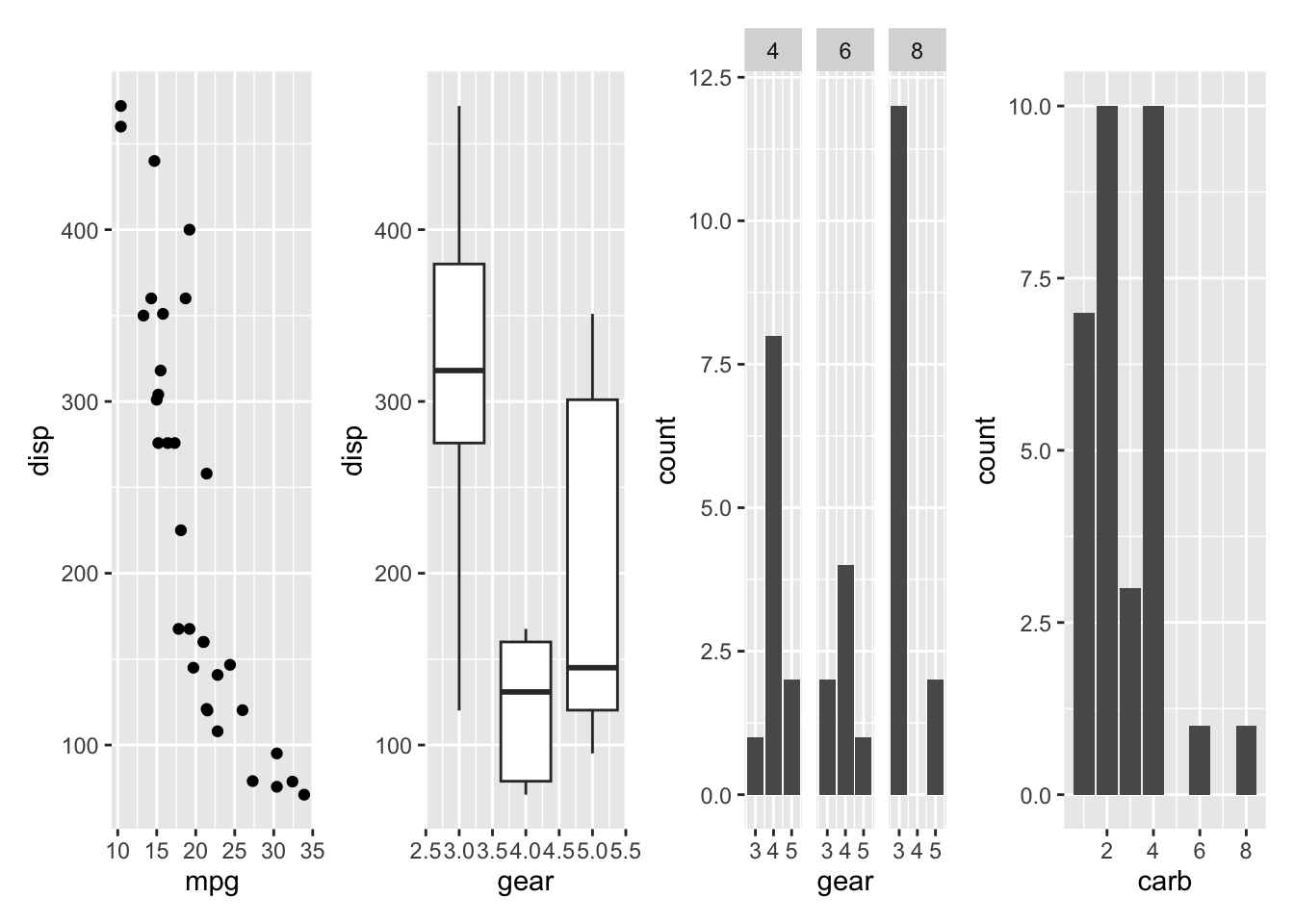
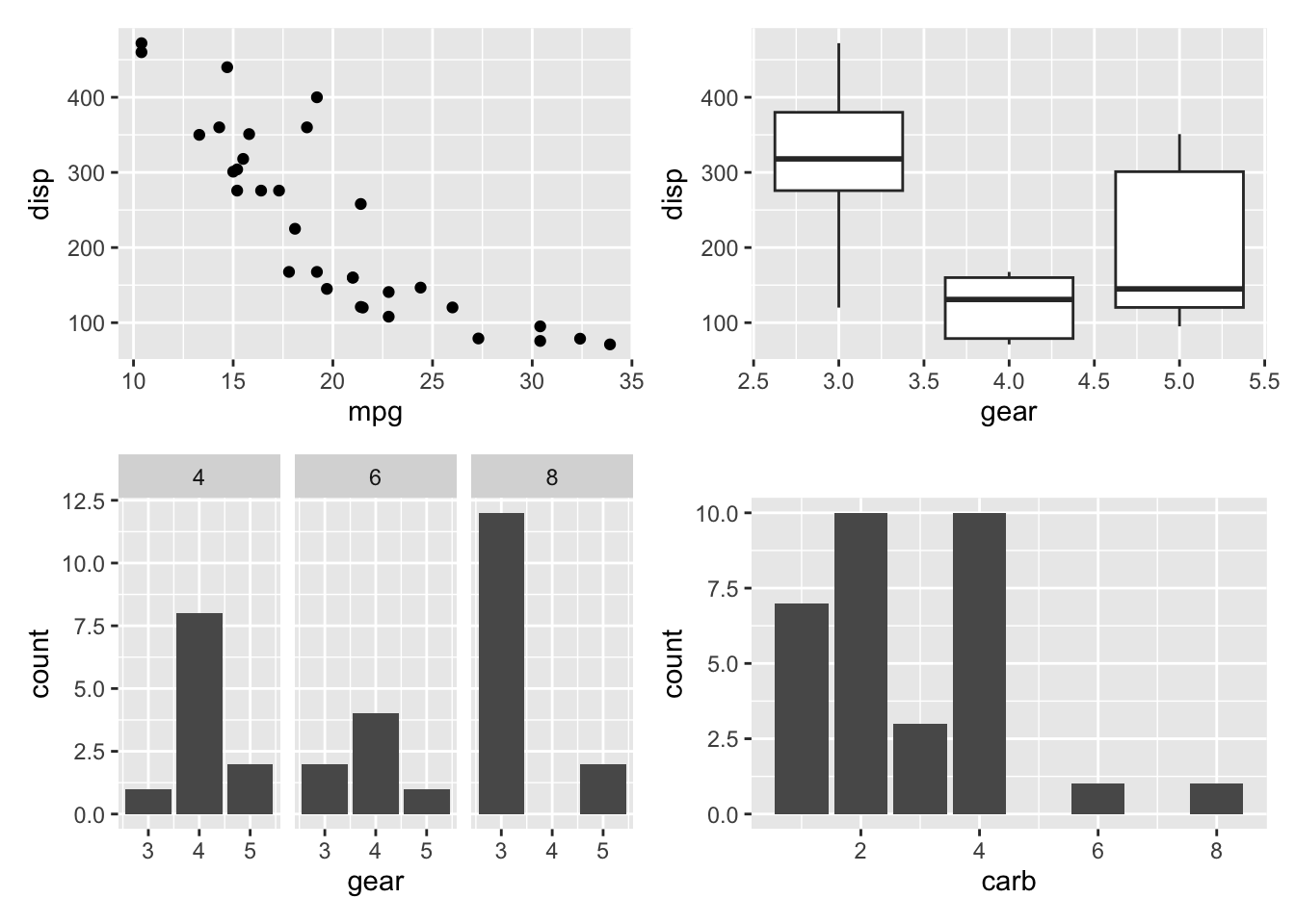
library ( ggplot2 ) p1 <- ggplot ( mtcars ) + geom_point ( aes ( mpg , disp ) ) p2 <- ggplot ( mtcars ) + geom_boxplot ( aes ( gear , disp , group = gear ) ) p3 <- ggplot ( mtcars ) + geom_bar ( aes ( gear ) ) + facet_wrap ( ~ cyl ) p4 <- ggplot ( mtcars ) + geom_bar ( aes ( carb ) ) p5 <- ggplot ( mtcars ) + geom_violin ( aes ( cyl , mpg , group = cyl ) ) p6 <- ggplot ( mtcars ) + geom_point ( aes ( mpg , disp ) ) + facet_wrap ( ~ cyl )
patchworkは、複数のggplot結果を1つ(ページ)のグラフィックに簡単に配置できるようにするRパッケージです。同様の目的のために、gridExtraやcowplotなどの他のパッケージも使用できます。
patchworkの使用法は、+、|、()、/で構成されています。
| (vertical bar)
最初に、|は複数の画像を1行 に配置するために使用されます。
+
次に、+は、グリッド 形式で行順 に行と列を埋めるために複数の画像を配置するために使用されます
画像のレイアウトを指定するには、plot_layout関数を使用します
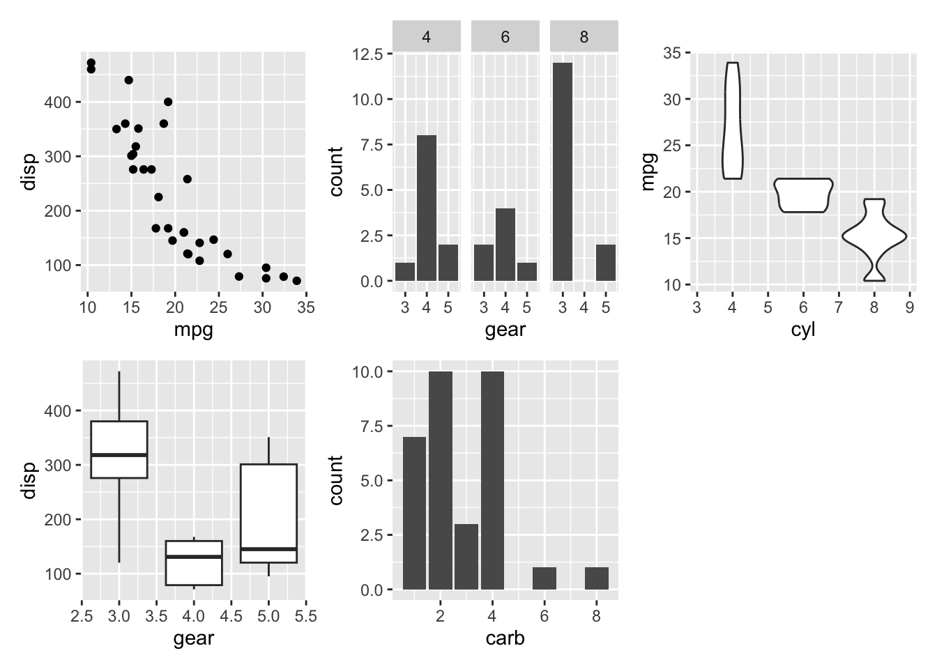
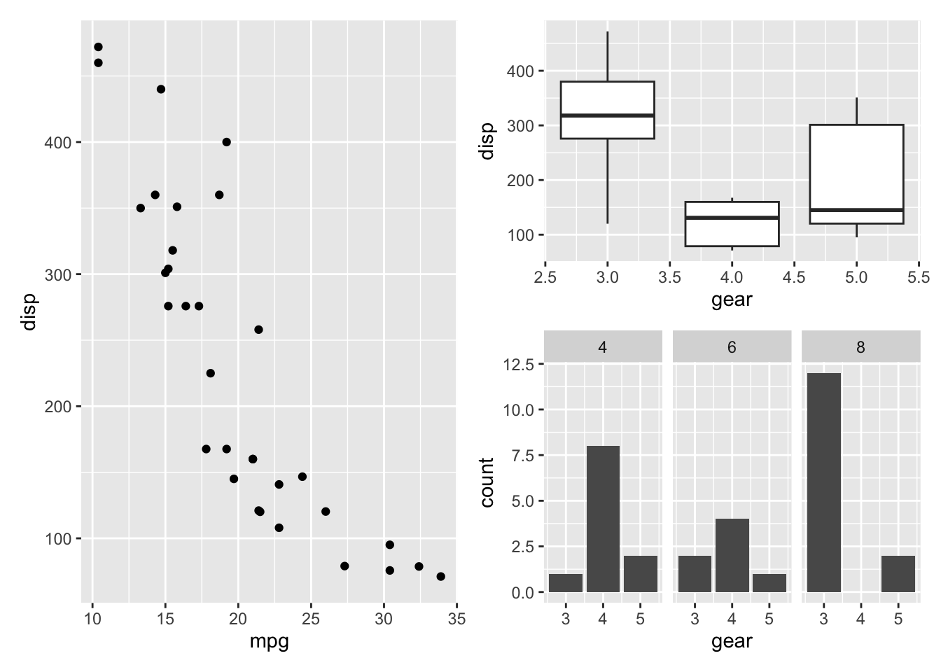
p1 + p2 + p3 + p4 + p5 + plot_layout ( ncol = 3 , byrow = FALSE )
( )
最後に、( )を使用すると画像を1つのグループ にグループ化して配置できます
もちろん、patchworkにはさまざまな機能が用意されています。詳細については、公式ドキュメント を参照してください。
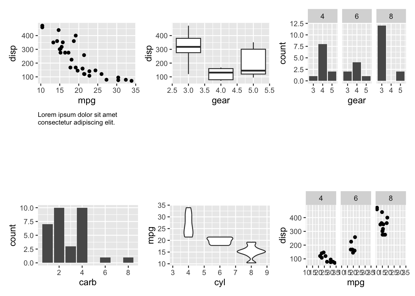
これを使用して、前に作成した6つの例の画像をpptの1ページに配置してみましょう。
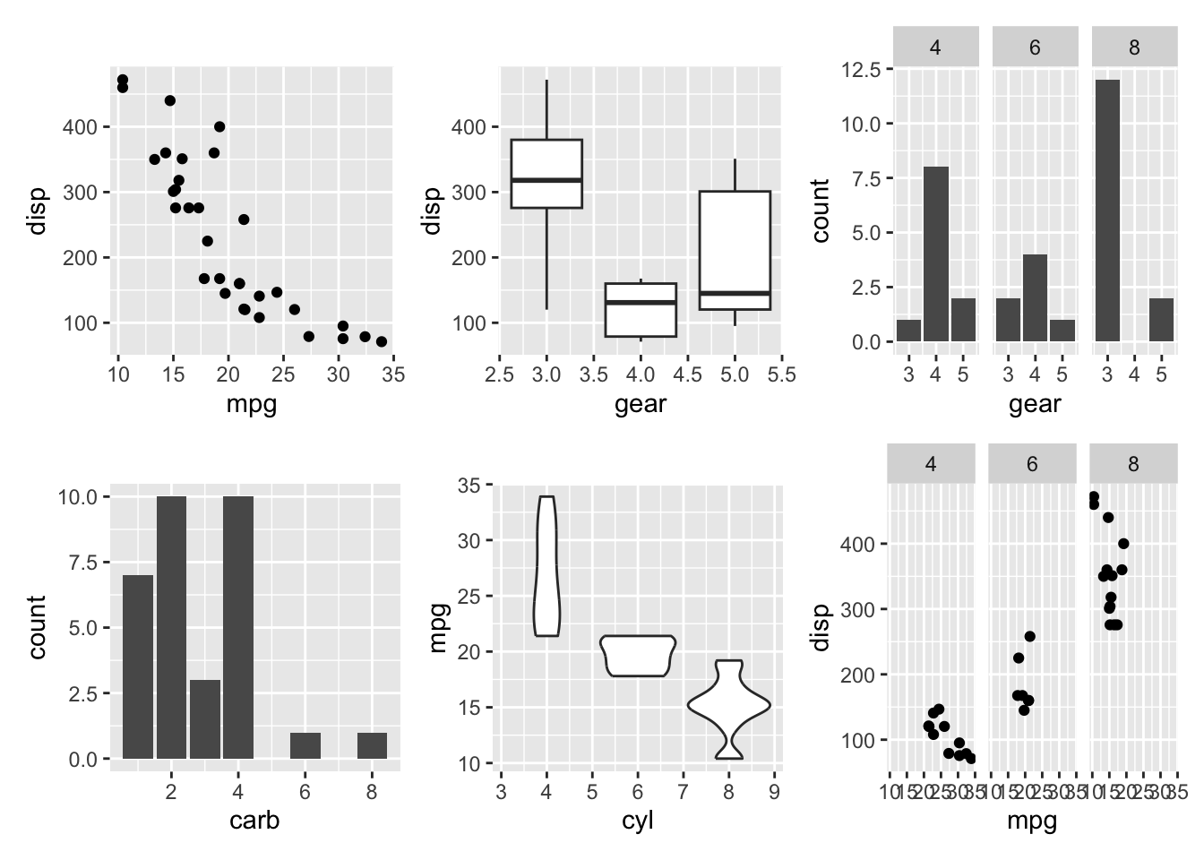
combined_plot <- ( p1 | p2 | p3 ) / ( p4 | p5 | p6 ) +
theme ( plot.margin = margin ( 1 , 10 , 1 , 10 ) )
combined_plot
cowplot
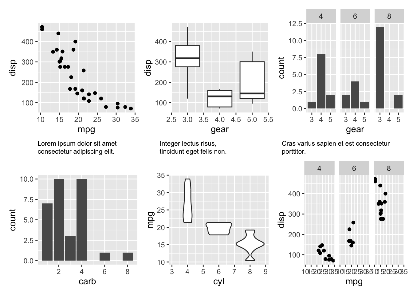
次に、cowplotを使用して、画像間にキャプション とボックス を追加する方法について説明します。
まず、最初の画像3枚を表現する架空のキャプションを list 形式で生成します。ちなみに <br> は改行を意味します。
内容は lorem ipsum を使用しました。
text <- list ( p1 = "Lorem ipsum dolor sit amet <br> consectetur adipiscing elit." ,
p2 = "Integer lectus risus, <br> tincidunt eget felis non." ,
p3 = "Cras varius sapien et est consectetur porttitor."
)
これを前の combined_plot に追加します。
combined_plot <- ( p1 | p2 | p3 ) / ( text $ p1 | text $ p2 | text $ p3 ) /
( p4 | p5 | p6 ) +
theme ( plot.margin = margin ( 1 , 10 , 1 , 10 ) )
# combined_plot # ERROR !!
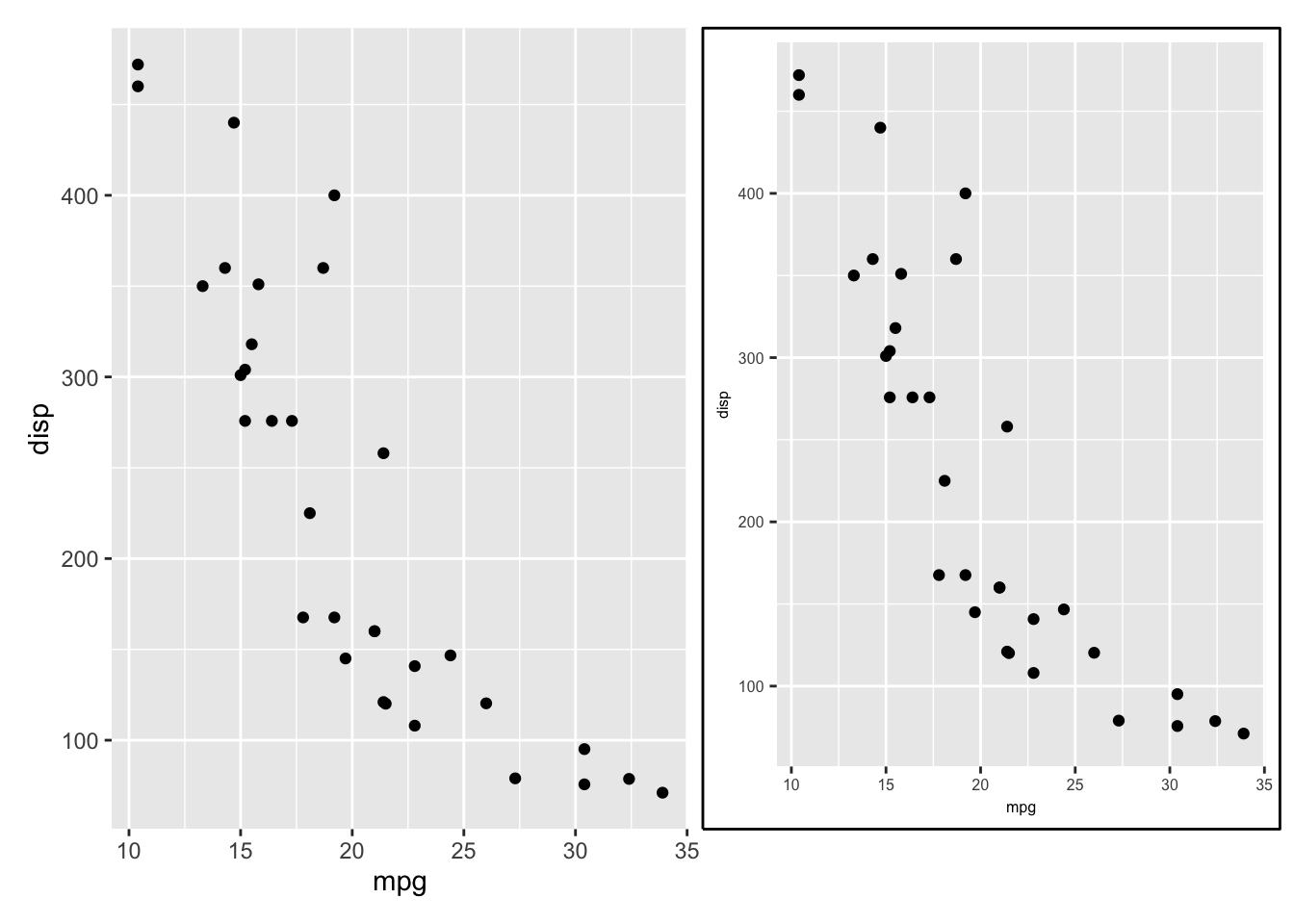
しかし、この状態では、テキストオブジェクトには単純なテキストのみが含まれているため、エラーが発生します。 これを解決するには、cowplotの ggdraw 関数を使用します。
ggdraw
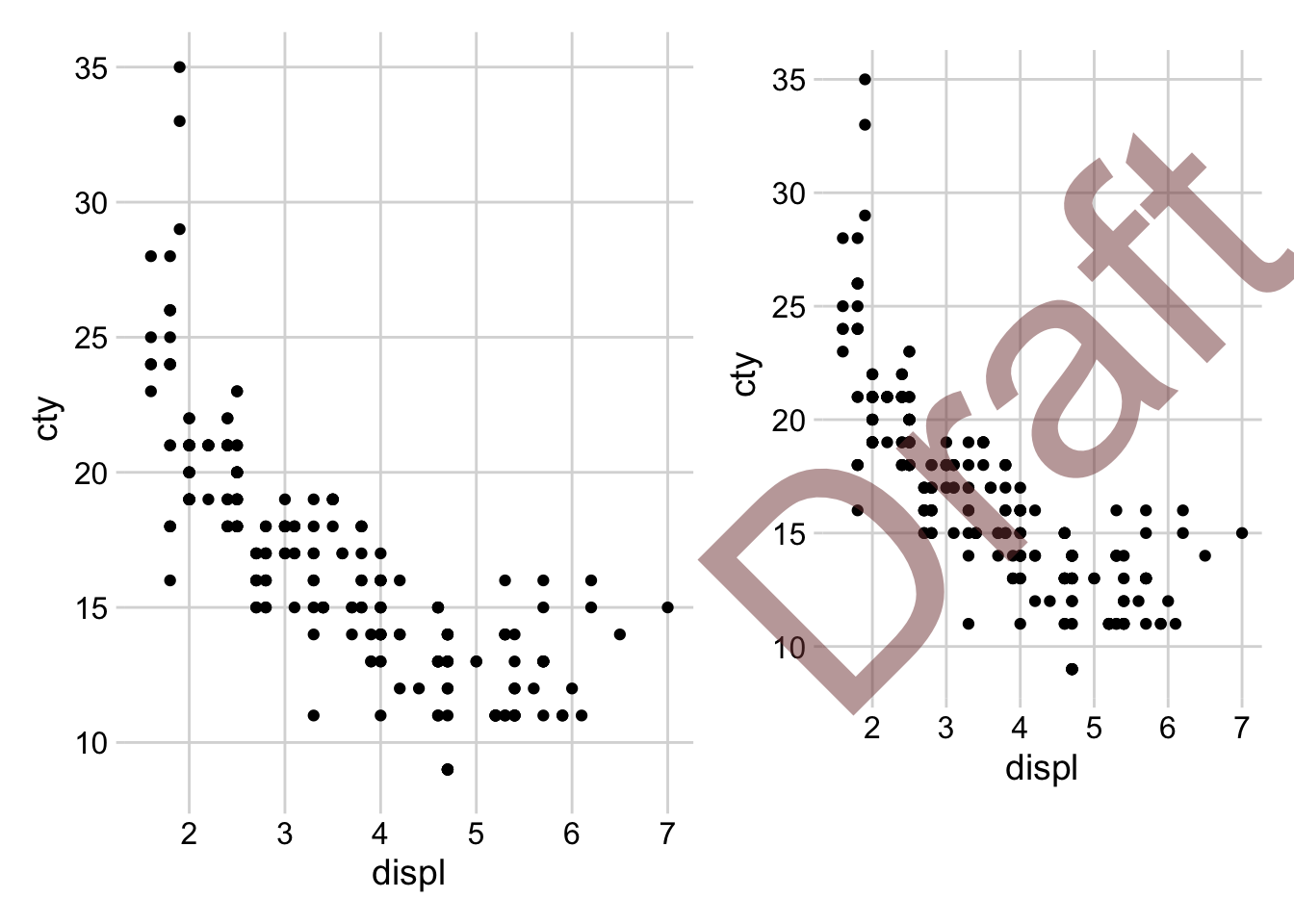
まず、cowplotはggplot2の結果に注釈やテーマを追加する機能を提供するRパッケージです。 ggdrawは、ggplot2の結果に追加のグラフィックを描画できるように、最上位レベルのレイヤーを追加すると考えてください。
scatter <- ggplot ( mpg , aes ( displ , cty ) ) + geom_point ( ) +
theme_minimal_grid ( )
draft <- ggdraw ( scatter ) + draw_label ( "Draft" , colour = "#80404080" , size = 120 , angle = 45 )
scatter | draft
前のテキストコンテンツから最初のラベル(p1)をラベルとして持つggplotオブジェクト を作成し、それを combined_plot に追加
combined_plot <- ( p1 | p2 | p3 ) / (
ggdraw ( ) +
labs ( subtitle = text $ p1 ) +
theme_void ( ) +
theme (
text = element_text ( size = 8 ) ,
plot.subtitle = ggtext :: element_textbox_simple (
hjust = 0 ,
halign = 0 ,
margin = margin ( 3 , 0 , 0 , 0 )
) ,
plot.margin = margin ( 0 , 0 , 0 , 0 )
)
) /
( p4 | p5 | p6 ) +
theme ( plot.margin = margin ( 1 , 10 , 1 , 10 ) )
combined_plot
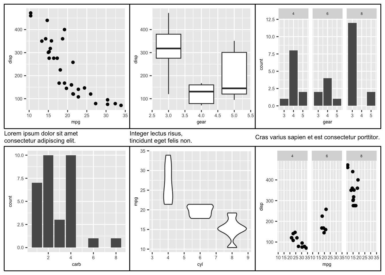
次に、残りのラベルを追加する前に、ラベルのカスタマイズに繰り返し使用される機能を別の関数にしてみましょう。 さらに、キャプション部分を縮小するために、plot_layoutのheightを使用して高さを調整します。
次に、各可視化をボックス(境界)で囲む方法について説明します。 これを行うには、各可視化にレイヤーを作成するために ggdraw を使用し、 そのレイヤーに draw_line 関数を使用して (0,0) から (1,1) を通る線を追加します。
さらに、各可視化のテキストプロパティを調整するために theme 関数を使用します。
text_theme <- theme ( text = element_text ( size = 6 ) ,
axis.text = element_text ( size = 6 ) ,
axis.title = element_text ( size = 6 ) ,
axis.title.x = element_text ( size = 6 ) ,
axis.title.y = element_text ( size = 6 ) ,
plot.title = element_text ( size = 6 ) ,
legend.text = element_text ( size = 6 ) ,
legend.title = element_text ( size = 6 )
) ( p1 |
ggdraw ( p1 + text_theme ) +
draw_line (
x = c ( 0 , 1 , 1 , 0 , 0 ) ,
y = c ( 0 , 0 , 1 , 1 , 0 ) ,
color = "black" ,
size = 0.5
)
)
前述のように、(繰り返し)ボックスを作成するための関数を作成して使用しましょう。
officer
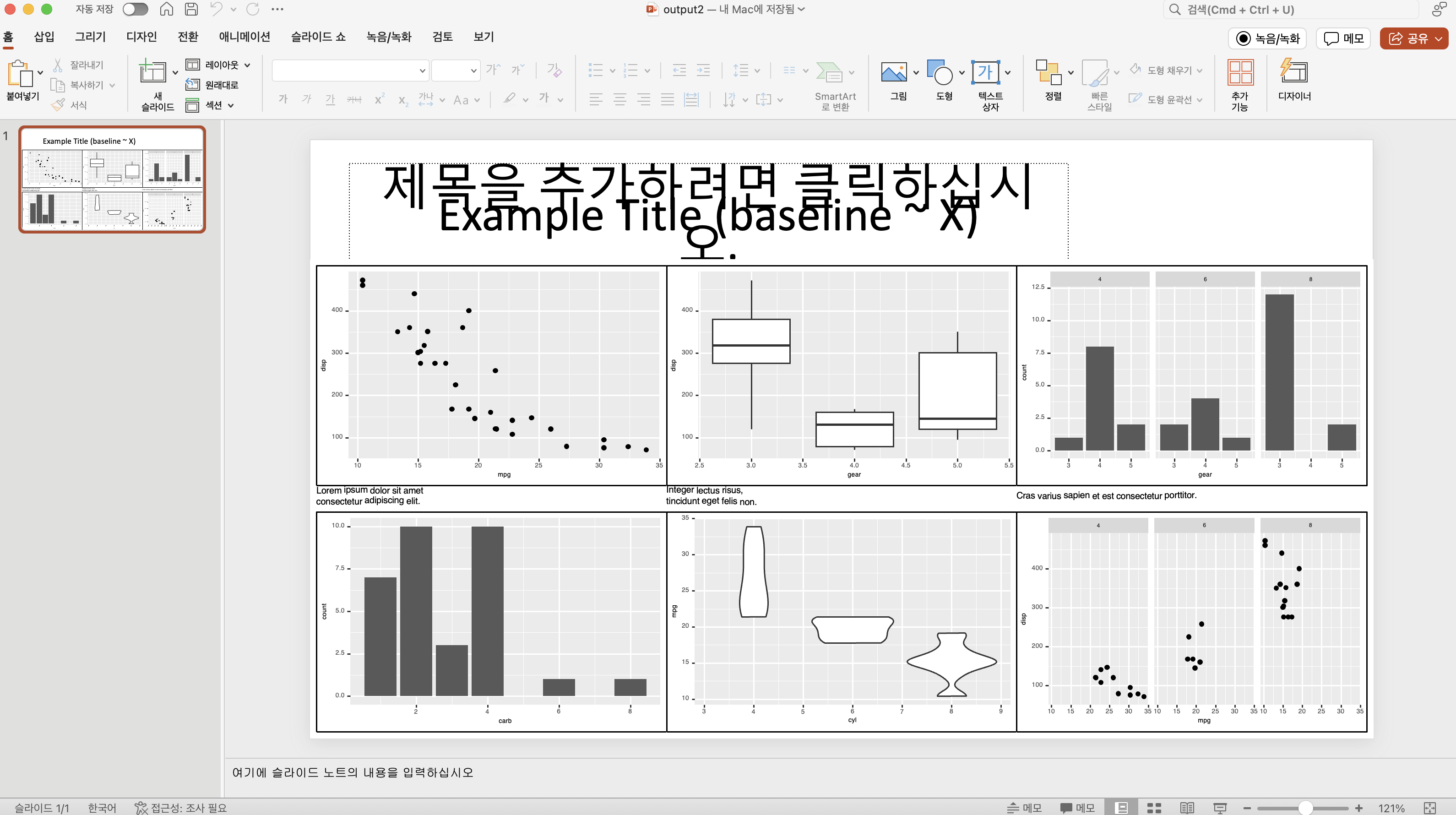
次に、上で作成したグラフを officer パッケージを使用して ppt に追加してみましょう。
officer の基本的な紹介については、以前の 記事 を参照してください.
officer では、read_pptx 関数を使用して ppt オブジェクトを作成し、ファイルが指定されていない場合は、幅と高さが 4:3 比率 の新しいオブジェクトを作成します。
これをそのまま使用すると、慎重に作成したレイアウトが壊れる可能性があるため、ppt で任意のサイズのテンプレートを作成し、ファイルとして読み込みます。
ppt を作成した後、ページ設定 でサイズを 16:9 または ワイドスクリーン に変更することができますが、グラフ要素を再配置する必要があります。
read_pptx ("~/Documents/template.pptx" ) |> remove_slide (1 ) |> add_slide () |> ph_with (value = "Example Title (baseline ~ X)" , location = ph_location_type (type = "title" )|> ph_with (:: dml (ggobj = combined_plot), location = ph_location (left = 0 , top = 1.5 , height = 6 , width = 13.333 )|> print (target = "output2.pptx" )
上記のコードで remove_slide 関数を使用しない場合、既存のテンプレートスライド 後 に ggplot 結果を含むスライドが作成されるため、以下のように不要な最初のページから始まります。
一方、remove_slide と add_slide の両方を削除し、ph_with で画像のみを追加すると、以下のようにテンプレートのタイトルと新しく追加されたタイトルが重なります。
read_pptx ( "~/Documents/template.pptx" ) |> ph_with (
value = "Example Title (baseline ~ X)" ,
location = ph_location_type ( type = "title" )
) |>
ph_with (
rvg :: dml ( ggobj = combined_plot ) ,
location = ph_location ( left = 0 , top = 1.5 , height = 6 , width = 13.333 )
) |>
print ( target = "output2.pptx" )
そのため、テンプレートを使用する場合は、remove_slide と add_slide を使用することをお勧めします。
summary
この記事では、patchwork と cowplot を使用して複数のグラフを組み合わせ、軽微なカスタマイズを行い、officer を使用して ppt に追加する方法を学びました。 R の機能と ppt を結びつける方法はさまざまであり、これによりより効率的に作業できるようになるでしょう。
最終的なコードは以下
このコンテンツは github copilot で翻訳されました
Code library ( ggplot2 ) library ( patchwork ) library ( cowplot ) library ( officer ) p1 <- ggplot ( mtcars ) + geom_point ( aes ( mpg , disp ) ) p2 <- ggplot ( mtcars ) + geom_boxplot ( aes ( gear , disp , group = gear ) ) p3 <- ggplot ( mtcars ) + geom_bar ( aes ( gear ) ) + facet_wrap ( ~ cyl ) p4 <- ggplot ( mtcars ) + geom_bar ( aes ( carb ) ) p5 <- ggplot ( mtcars ) + geom_violin ( aes ( cyl , mpg , group = cyl ) ) p6 <- ggplot ( mtcars ) + geom_point ( aes ( mpg , disp ) ) + facet_wrap ( ~ cyl ) text <- list ( p1 = "Lorem ipsum dolor sit amet <br> consectetur adipiscing elit." ,
p2 = "Integer lectus risus, <br> tincidunt eget felis non." ,
p3 = "Cras varius sapien et est consectetur porttitor."
) cap <- function ( text ) { ggdraw ( ) +
labs ( subtitle = text ) +
theme_void ( ) +
theme (
text = element_text ( size = 8 ) ,
plot.margin = margin ( 0 , 0 , 0 , 0 )
)
} text_theme <- theme ( text = element_text ( size = 6 ) ,
axis.text = element_text ( size = 6 ) ,
axis.title = element_text ( size = 6 ) ,
axis.title.x = element_text ( size = 6 ) ,
axis.title.y = element_text ( size = 6 ) ,
plot.title = element_text ( size = 6 ) ,
legend.text = element_text ( size = 6 ) ,
legend.title = element_text ( size = 6 )
) with.box <- function ( p ) { ggdraw ( p + text_theme ) +
cowplot :: draw_line (
x = c ( 0 , 1 , 1 , 0 , 0 ) ,
y = c ( 0 , 0 , 1 , 1 , 0 ) ,
color = "black" ,
size = 0.5
)
} combined_plot <- ( with.box ( p1 ) | with.box ( p2 ) | with.box ( p3 ) ) / ( cap ( text $ p1 + text_theme ) | cap ( text $ p2 + text_theme ) | cap ( text $ p3 + text_theme ) ) /
( with.box ( p4 ) | with.box ( p5 ) | with.box ( p6 ) ) +
plot_layout ( heights = c ( 5 , 0.1 , 5 ) ) +
theme ( plot.margin = margin ( 1 , 10 , 1 , 10 ) )
combined_plot read_pptx ( "~/Documents/template.pptx" ) |> ph_with (
value = "Example Title (baseline ~ X)" ,
location = ph_location_type ( type = "title" )
) |>
ph_with (
rvg :: dml ( ggobj = combined_plot ) ,
location = ph_location ( left = 0 , top = 1.5 , height = 6 , width = 13.333 )
) |>
print ( target = "output2.pptx" )
Citation BibTeX citation:
@online{kim2024,
  author = {Kim, Jinhwan},
  title = {Patchwork를 {활용한} {고급} {시각화}},
  date = {2024-05-17},
  url = {https://blog.zarathu.com/jp/posts/2024-05-17-patchwork/},
  langid = {en}
}
For attribution, please cite this work as: